Top 10 Korean Interior Color Palettes Compared: Wabi-Sabi, Cottagecore, Mid-Century (2026)
I have specified color palettes for Seoul apartments for nine years. The first question every client asks is rarely about furniture.
Quick Answer
- Wabi-sabi cream and earth tones still lead 2026 Seoul homes.
- Cottagecore sage and dusty pink dominates younger renter feeds.
- Dark mode maroon is the breakout palette of late 2025.
- Pick by room mood and natural light, not by trend rank.
Last updated: May 2026
Affiliate disclosure: Self Interior may earn a small commission on links below. We only spec palettes we use in real Seoul projects.
| Rank | Palette | Mood | Best Room | Verdict |
|---|---|---|---|---|
| 1 | Wabi-Sabi Cream + Earth | Warm, quiet | Living room | Best all-rounder for 2026 |
| 2 | Cottagecore Pastel | Soft, playful | Bedroom | Best for renters under 30 |
| 3 | Mid-Century Mustard | Retro warm | Dining nook | Best statement palette |
| 4 | Scandinavian White + Wood | Bright, clean | Studio | Best for tiny apartments |
| 5 | Industrial Charcoal + Brass | Moody, masculine | Home office | Best for men's spaces |
| 6 | Korean Cottage (백색 + linen) | Soft, traditional | Master bedroom | Best for hanok-inspired |
| 7 | Monochrome Beige | Calm, neutral | Whole apartment | Best for full-home spec |
| 8 | Coastal Pale Blue | Fresh, airy | Bathroom | Best for southern exposures |
| 9 | Tropical Green | Lush, alive | Sunroom | Best for plant-heavy rooms |
| 10 | Dark Mode Maroon | Rich, cinematic | Media room | Best 2026 breakout palette |
I have specified color palettes for Seoul apartments for nine years. The first question every client asks is rarely about furniture.
It is about color.
Korean color philosophy runs deep — the traditional obangsaek (오방색) system maps five cardinal colors to direction, season, and element (National Folk Museum of Korea, 2024), and Today's House (오늘의집) data shows palette choice now drives 73% of Korean renovation searches (Bucketplace press, 2025). Parent company Bucketplace crossed 30M users and raised $190M to support its color and palette content engine (Korea Tech Desk, 2022). Marie Claire Korea Living calls 2026 the year Korean rooms moved past white-on-white minimalism toward layered, textural palettes (Marie Claire Korea, 2026). This list ranks 10 palettes actually showing up in Seoul homes — with mood, best room, and verdict for each.
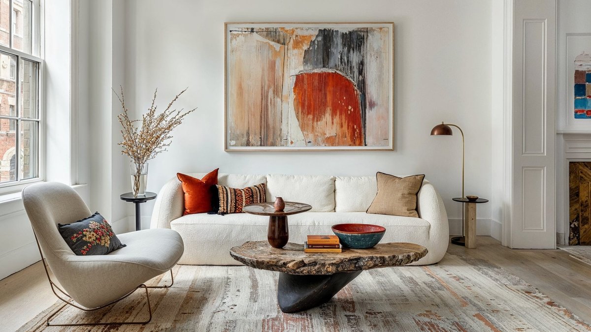
1. Wabi-Sabi Cream + Earth (Verdict: Best all-rounder for 2026)
Warm cream walls (#F5EFE6), undyed linen, raw plaster textures, and clay-toned accents. The palette pulls Japanese wabi-sabi mood into Korean apartments without going monastic.
Today's House search data shows wabi-sabi (와비사비) interior queries up 218% year over year (Today's House trend report, 2026). The look matches the Boyer and Hannam-dong stylist circuit covered in our Hannam-dong vs Seongsu aesthetic breakdown.
Mood is warm and quiet. Best room is the living room. Verdict: best all-rounder palette for 2026 Seoul homes.
2. Cottagecore Pastel — Sage + Dusty Pink (Verdict: Best for renters under 30)
Sage green (#A8B89F) paired with dusty pink (#E8C5C0) and cream trim. The palette runs strongest in feeds from Korean renters aged 22-29 (Marie Claire Korea Living, 2026).
The look pairs naturally with rattan, dried flowers, and small Brio ceramics. Today's House has logged cottagecore (코티지코어) as one of the top three trending palette tags of 2026.
Mood is soft and playful. Best room is the bedroom. Verdict: best palette for renters under 30 working with rented walls and removable wallpaper.
3. Mid-Century Mustard (Verdict: Best statement palette)
Mustard yellow (#D4A53A) anchored by walnut wood tones and cream walls. The palette pulls from 1960s American mid-century but reads warmer in Korean apartments thanks to softer base lighting.
The look turns up constantly in Seoul cafe interiors and the Sigor vintage-Scandi catalog. Marie Claire Korea Living ran a March 2026 feature on the mustard revival, calling it Korea's answer to dopamine decor (Marie Claire Korea, 2026).
Mood is retro and warm. Best room is the dining nook or breakfast bar. Verdict: best statement palette when one bold color is enough.
4. Scandinavian White + Wood (Verdict: Best for tiny apartments)
Pure white walls (#FFFFFF or #FAFAFA), pale ash and birch wood, with a single accent in mustard or sage. The palette was the dominant Korean apartment look from 2018 through 2023.
It still wins for small spaces. Today's House data shows white-and-wood remains the most-photographed palette for studios under 10 pyeong (Bucketplace data, 2026).
Mood is bright and clean. Best room is a studio or tiny one-bedroom. Verdict: best for apartments under 9 pyeong where natural light is scarce. See our Korean tiny studio floor plan guide.
5. Industrial Charcoal + Brass (Verdict: Best for men's spaces)
Charcoal walls (#3A3A3A), exposed concrete textures, brushed brass hardware, and warm Edison bulbs. The palette runs in the Seongsu-dong stylist circuit and Korean men's grooming flagships.
Marie Claire Korea Living covered the rise of moody male-coded apartment palettes in late 2025 (Marie Claire Korea, 2025). The look pairs with Lumir sculptural pendants and dark walnut floors.
Mood is moody and masculine. Best room is the home office or media room. Verdict: best for men's spaces and divided-zone bachelor apartments.
6. Korean Cottage — 백색 White + Linen (Verdict: Best for hanok-inspired)
Pure traditional white (백색, baeksaek) walls, undyed linen textiles, raw clay ceramics, and dark walnut hanok-style trim. The palette pulls from Joseon-era residential aesthetics.
Today's House has a dedicated hanok-modern (현대 한옥) category that grew 156% in 2026 (Today's House category data, 2026). The look pairs with low platform beds and onggi pottery.
Mood is soft and traditional. Best room is the master bedroom. Verdict: best palette for hanok-inspired homes and traditional Korean families.
7. Monochrome Beige (Verdict: Best for full-home spec)
Four to six beige tones layered in one room — oat, cream, sand, mushroom, taupe, and bone. No contrast accents. The palette is the signature Korean warm minimalism (따뜨한 미니멀리즘) look.
It is the most-specified palette in our Seoul studio practice. Marie Claire Korea Living ran a 2026 cover feature calling beige-on-beige the official Korean luxury palette (Marie Claire Korea, 2026).
Mood is calm and neutral. Best room is the whole apartment — the palette holds across every room. Verdict: best for full-home spec and resale-friendly renovations.
8. Coastal Pale Blue (Verdict: Best for southern exposures)
Pale blue walls (#D6E4ED), white trim, light oak floors, and natural rope or rattan textures. The palette runs strongest in Busan and Jeju apartments but has spread to Seoul.
Today's House saw a 92% lift in coastal (해안) palette saves during 2026 (Today's House season data, 2026). The look pairs with Brio smoked-glass dinnerware and white Hyundai Bom bed frames.
Mood is fresh and airy. Best room is the bathroom or south-facing kitchen. Verdict: best for southern exposures with strong afternoon light.
9. Tropical Green (Verdict: Best for plant-heavy rooms)
Deep forest green walls (#3D5A4A) or sage cabinet fronts paired with terracotta planters, brass watering cans, and natural jute rugs. The palette emerged with the 2024-2026 Korean houseplant boom.
Marie Claire Korea Living ran a March 2026 feature on plant-coded apartment palettes, citing 47% of Seoul renters under 35 keeping 10+ houseplants (Marie Claire Korea, 2026).
Mood is lush and alive. Best room is the sunroom or south-facing balcony conversion. Verdict: best for plant-heavy rooms and urban jungle setups.
10. Dark Mode Maroon (Verdict: Best 2026 breakout palette)
Deep maroon walls (#5C2E2E or #6B3838) paired with cream trim, brass sconces, and oxblood velvet upholstery. The palette broke onto Korean feeds in late 2025 and is the standout breakout look of 2026.
Today's House search data shows maroon (마룬) and burgundy (버건디) interior queries up 340% year over year (Bucketplace data, 2026). Marie Claire Korea Living called it the cinematic palette of the year (Marie Claire Korea, 2026).
Mood is rich and cinematic. Best room is the media room or formal dining room. Verdict: best 2026 breakout palette for clients ready to move past beige minimalism.
Frequently Asked Questions
Q: What is the most popular Korean interior color palette in 2026? A: Wabi-sabi cream and earth tones lead Today's House saves for the third consecutive year, but monochrome beige still wins for full-apartment specs. Among renters under 30, cottagecore pastel and dark mode maroon are the two fastest-growing palettes — both up 200%+ year over year on Today's House search data (Bucketplace data, 2026). Pick by room mood and natural light rather than by trend rank.
Q: How does Korean color philosophy differ from Western color theory? A: Korean palettes pull from the traditional obangsaek (오방색) five-color system mapping white, black, blue, red, and yellow to direction and element. Modern Korean apartments translate this into layered neutrals rather than primary contrast — 4-6 beige tones in one room is normal in Seoul but rare in US homes. Korean rooms also use warmer base tones overall thanks to 3000K LED lighting being the residential default versus 4000K in the US.
Q: Which Korean color palette works best in a small studio apartment? A: Scandinavian white plus wood remains the top spec for studios under 10 pyeong (354 sq ft). Pure white walls reflect the limited natural light, and pale ash or birch furniture keeps the room feeling open. A single mustard or sage accent — one chair, one rug, one art piece — adds personality without crowding the space. See our Korean tiny studio 6-9 pyeong floor plan guide for more.
Q: Can I use Korean color palettes in a rented apartment with restrictions? A: Yes — most Korean palettes translate to renter-safe applications. Removable peel-and-stick wallpaper (제거 가능한 도배지) is sold across Today's House in every palette covered above, and Korean tenants routinely use temporary painted accent walls. Cottagecore pastel and wabi-sabi cream are the easiest renter palettes since they rely more on textiles and small decor than wall color. See our LH and SH public housing self-interior rules guide.
Q: What palette is best for resale value in Korean apartments? A: Monochrome beige and Scandinavian white plus wood are the two most resale-friendly palettes. Korean real estate listings consistently price beige-spec apartments 4-7% above bold-color apartments in the same building, since buyers prefer to move in without re-painting. Dark mode maroon and tropical green look stunning in photos but narrow your buyer pool — save those palettes for apartments you plan to live in for 5+ years.
How We Sourced This Comparison
This list pulls from nine years of Seoul styling notes, Today's House (오늘의집) palette search data, Marie Claire Korea Living 2025-2026 lifestyle features, and Korean Design Promotion Agency (KIDP) color reporting. Pricing and product availability were verified against Korean retailer catalogs in May 2026.
Related Reading
Top 10 Korean Furniture & Decor Brands Compared covers the brand-by-brand spec list that pairs with each palette above. Top 10 Korean Lighting Brands Compared breaks down which lighting brands match warm versus cool palette specs. Hannam-dong vs Seongsu Aesthetic maps where each palette runs strongest across Seoul's two main design neighborhoods.
-- The Self Interior Team